I’ve learned a lot from regular data visualization practice every Sunday morning over 16 straight weeks so far. MakeoverMonday even has a submissions tracker that shows where every participant is at every week.
I’m excited to say that apparently out of nearly a thousand participants, I am one of less than 40 people who seem to consistently participate every single week.
I can tell that I learned a lot, and I’m happy to show something here that I’m really excited about accomplishing this week.
Here’s a tutorial that involves the following:
Waffle charts with multiple colors
A third chart that changes based on two points of interaction from the viewer
Calculated fields & Parameters
Image backgrounds, floating elements, and more on dashboards
In creating my data visualization for this week, some of the items I’ll show are easier than others. Some of them involved a lot of problem solving to tweak it just right. My goal is to show the journey from start to finish.
Context on the Data
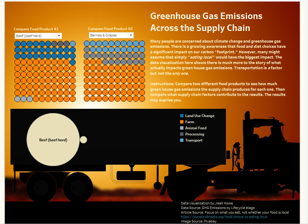
For this week’s MakeoverMonday topic, I looked at greenhouse gas emissions and what comprises them for various food products. The supply chain activities can vary in emissions for any given product.
Many might assume that simply “eating local” would impact the amount of greenhouse gas emissions the most. As we’ll see here, transportation is a factor but not the only factor.
For this reason, I set out to understand more holistically what is making some products have more greenhouse gas emissions than others. I had a vision in mind for really understanding proportions, hence why I went for a waffle chart. I also had a vision to show relative size. Even though transportation might make up a good portion of a particular product’s gas emissions, the overall emissions could vary greatly compared to another product.
Here’s how I did it.
Tutorial – Waffles & Pancakes
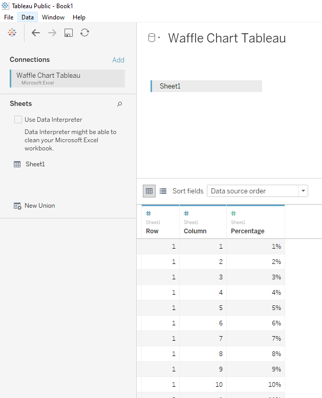
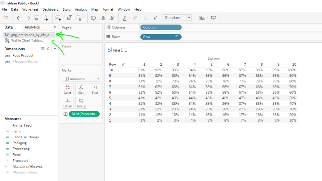
The first step in accomplishing my vision involved reusing the Waffle chart template I made a while back for another data visualization. There are also downloadable templates online for this as well.
I connected that template by itself to Tableau Public.
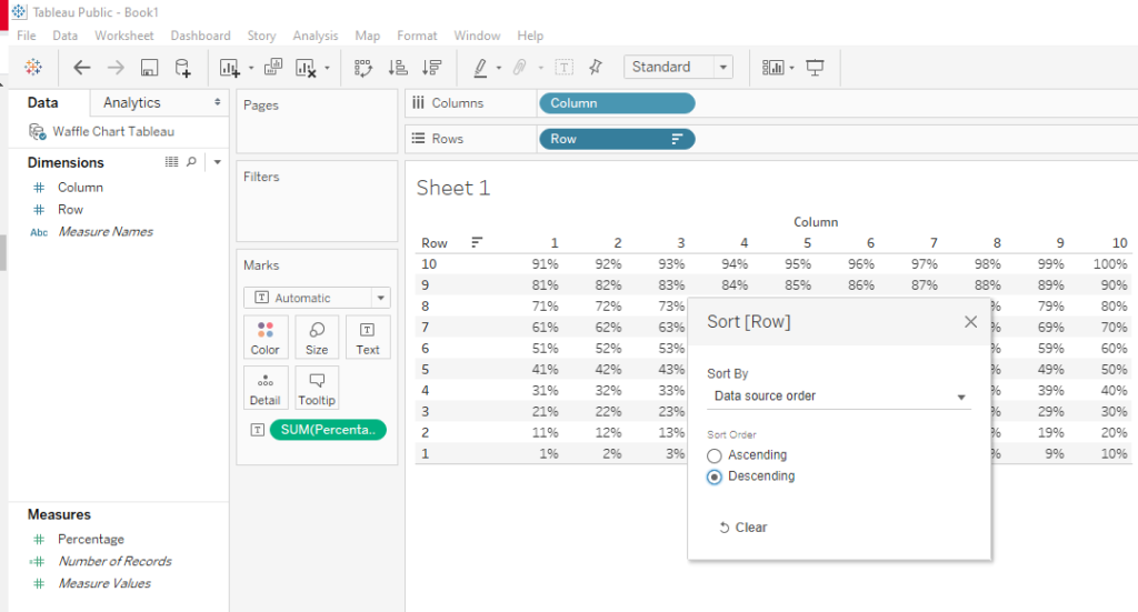
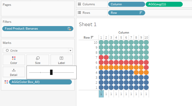
From there I poked around a bit to sort how I wanted the waffle chart to look. I placed the Column field on the columns shelf and the Row field on the rows shelf. I then sorted by descending, so then the percentages that will eventually be filled with color would fill up to the top.
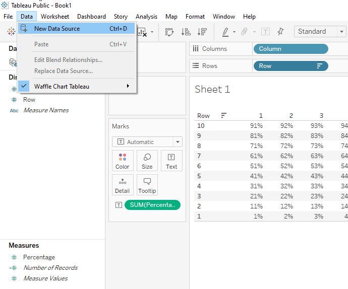
After that, I went to Data>New Data Source to connect in the actual data source I’ll need to represent within my waffle chart.
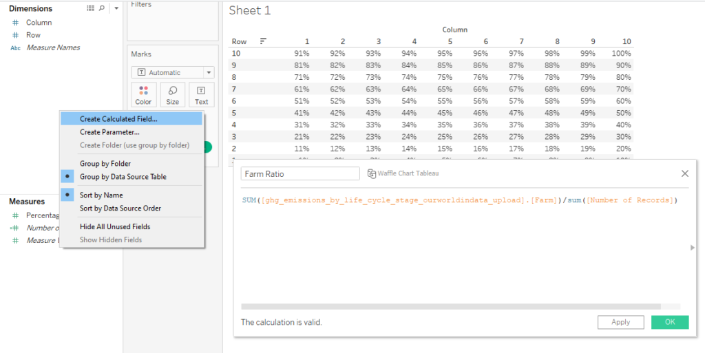
Calculated Fields – Ratios
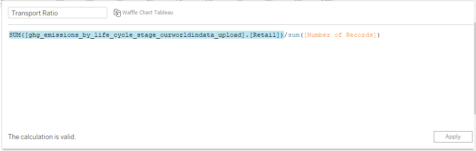
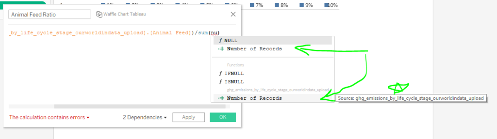
After that, I created calculated fields, very similarly to how I did waffle charts a while back. While the field itself looks a little crazy, the orange part is simply calling what the source and field it is. I happened to create these fields while clicked on the Waffle Chart Tableau data source, so this calculated field is referencing the <source.field> from the other data source. It is taking the emissions that happen during farming and dividing it by the number of records.
I created these “ratio” calculated fields for all the different supply chain factors.
***(If you are following this step by step, I just want to note before you get too far that I do end up revising these ratio calculated fields in particular. Scroll down further to Updated Calculated Fields – Ratios header for the actual steps in this part. Keep reading to discover why I show it all anyways.)
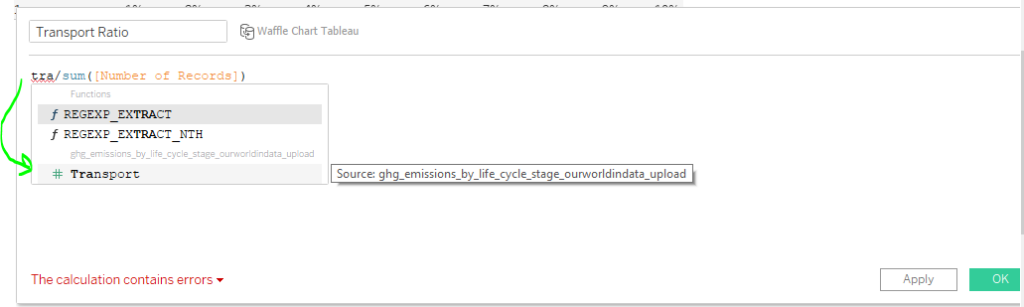
Here are a couple tips I wanted to share to make calculated fields go smoother. Many times, the orange print is not something I actually type out. I type a portion of the text and then click on it. Tableau fills in the rest.
Another tip is to know which fields you’re working with. Notice there are two “number of records” fields. One actually corresponds to our second data set and the other one corresponds to the waffle chart template. Mixing them up can cause issues.
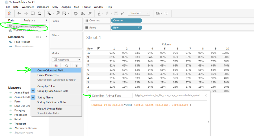
After I created my calculated fields for ratios, I created more calculated fields for coloring the “boxes” in the waffle. Here is an example of one of them I created at first.
Notice that this would only account for one color and one supply chain activity. I wanted to show all the colors. So that would be a different calculated field altogether instead. That, I will get to in the next section.
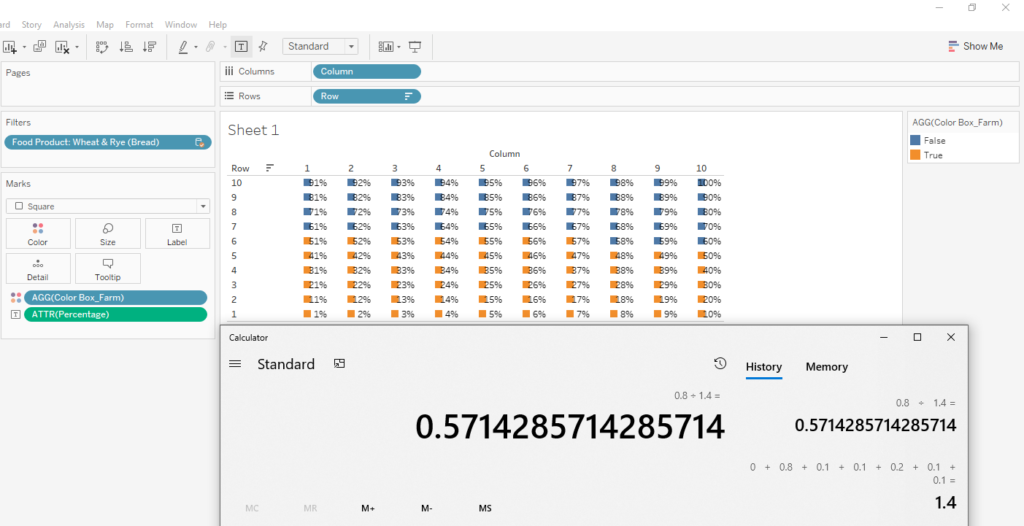
Here is where the problem lies. It has to do with the number of boxes colored for even just one supply chain activity.
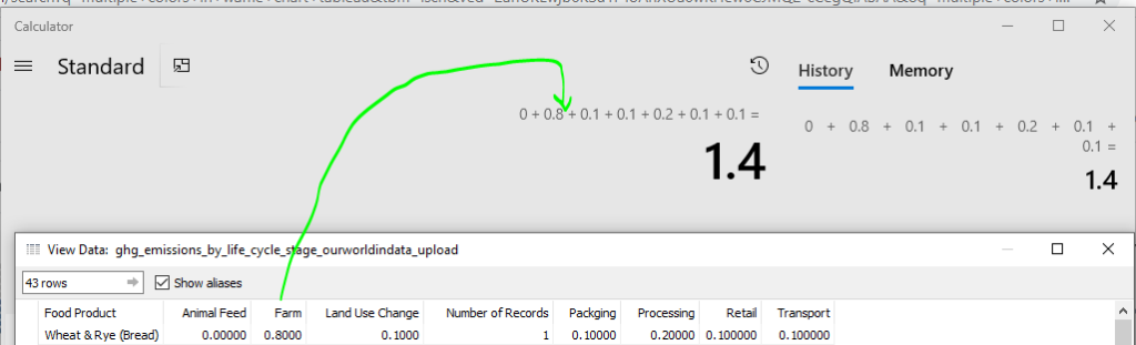
To investigate, I right clicked on the data source and selected View Data. What this did was show the raw data that is making up the data visualization. I like to do this to verify that I am indeed showing the data correctly.
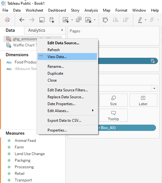
In this case, I wasn’t showing the data properly. The value 0.80 for Farm does not mean that 80% of emissions came from farming activities. 0.80 is the amount of emissions. If I actually want a proportion, then it needs to be out of the total emissions for that product in particular. In this case, it would be out of 1.4 because it is adding together that row.

Updated Calculated Fields – Ratios
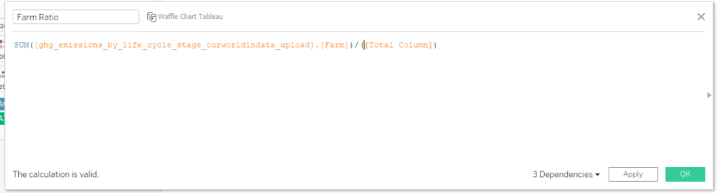
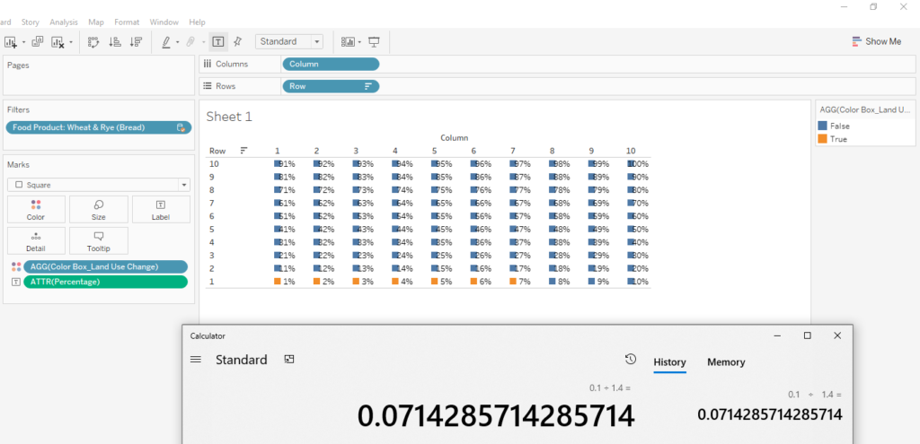
To remedy the situation, I tried creating a new “Total Column” in a calculated field. This will add up the respective supply chain factors for any given product in the row.
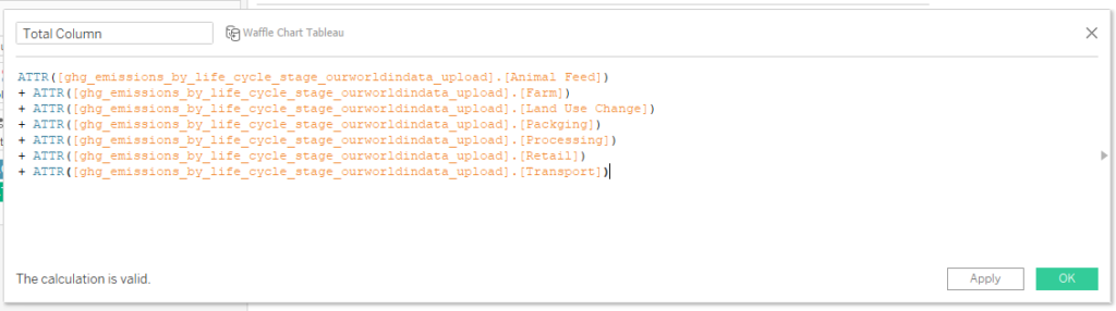
This Total Column will then go into the ratio calculated fields instead of what was there previously.
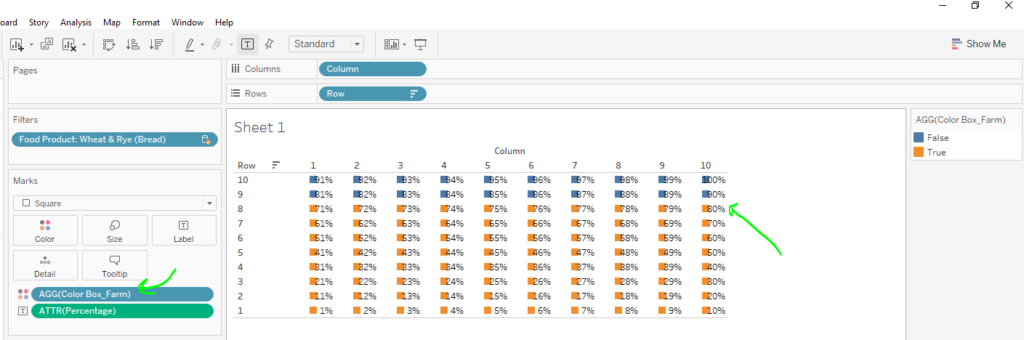
 Now the chart shows 57% colored in. Let’s check the math.
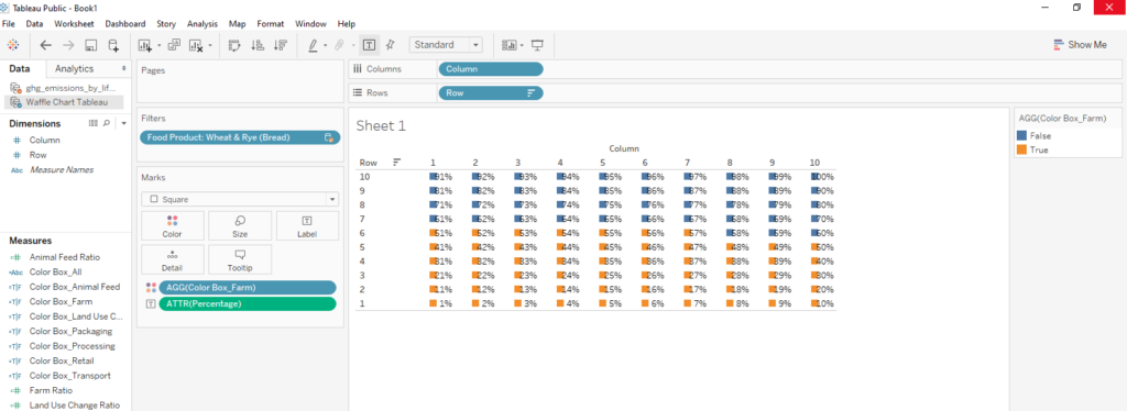
As I saw from verifying, it looked like it was finally showing the correct proportion. I checked a few other supply chain factors in isolation just to be sure.
Now, to create the color box for all instead of just one supply chain factor, I created a calculated field that looked like this.
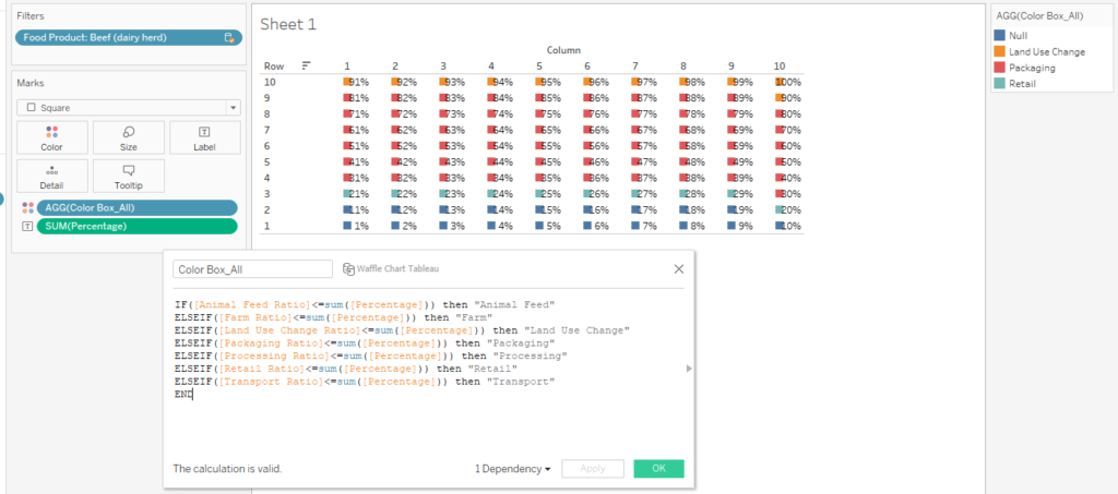
What this will do is tell Tableau to do different colors for different portions of the waffle chart. I dragged this calculated field to the colors on the marks card.
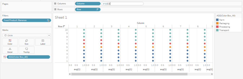
From there I started to get a little bit into formatting on the waffle chart. Here I show some steps in getting the shapes to line up evenly and come to life.
Create Parameters for the Waffle Charts
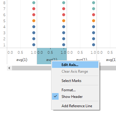
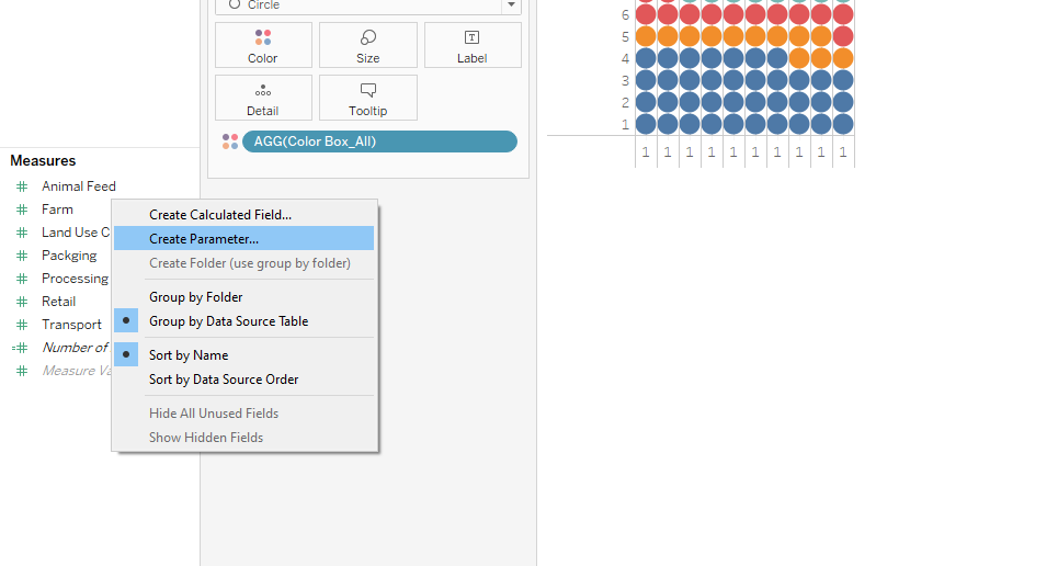
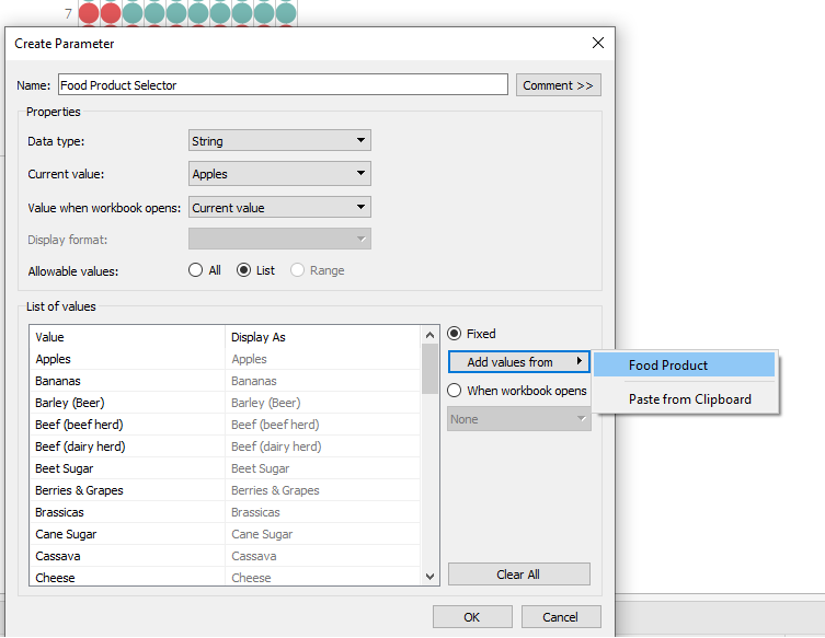
Now time for some parameters to help create “selectors” for some interactivity in the data visualization. I right clicked on the blank space in the worksheet and selected Create Parameter.
For this parameter, I specified that I wanted it to pull from the Food Product list. I ended up making two parameters that were pretty much identical and just called them “Food Product Selector 1” and “Food Product Selector 2.”
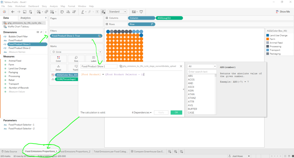
After that, I created two more calculated fields: “Food Product Show 1” and “Food Product Show 2.” Notice the orange and purple text. The orange is just a regular field in the data and the purple calls out the parameter name. 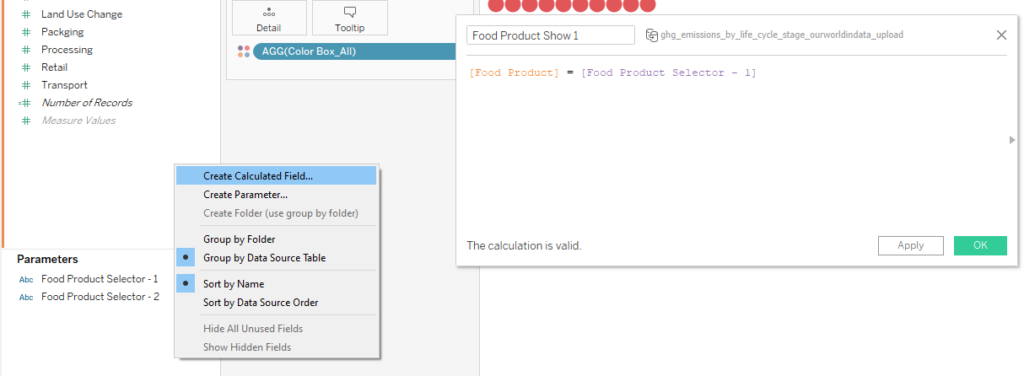
The “Food Product Show 1” calculated field was then placed on the filters card on the first waffle chart. I duplicated the waffle chart worksheet and then placed “Food Product Show 2” in the filters card instead.
So now we have food product selectors that will eventually control two waffle charts. Wouldn’t it be neat if we made those selectors each control a different chart altogether as well? Well, don’t mind if I do!
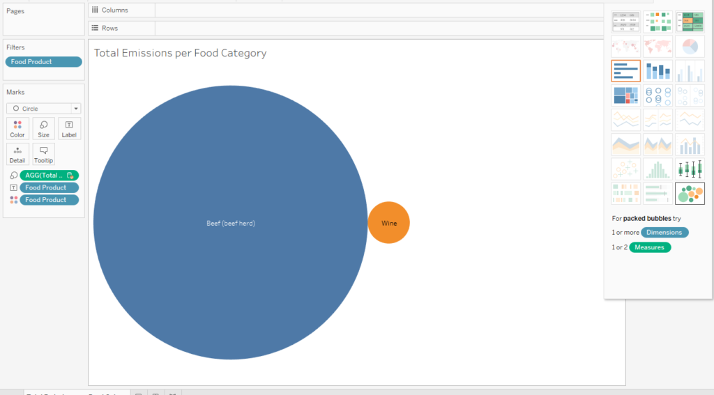
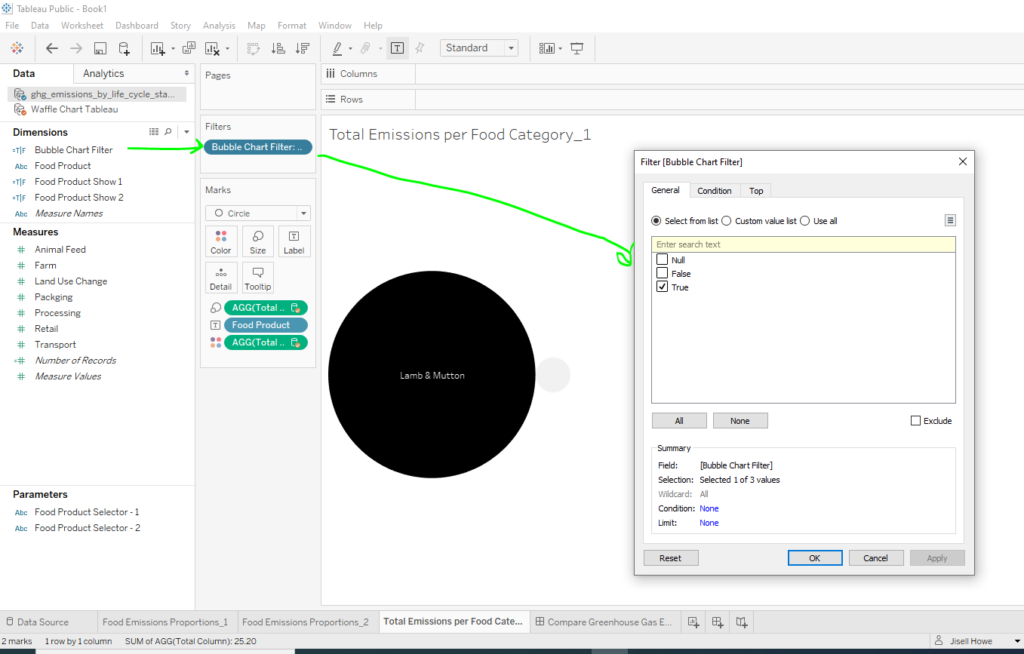
Here’s a bubble chart that shows total emissions for each food product. Or we can call them pancakes, just for fun. The screenshot currently shows Food Product on the filter shelf with two foods selected. But we want the interactive selectors to make those selections for us instead on the fly!
Here is a newly created calculated field that says that if the parameter selector comes up with a valid food product, then show that product. It will also do the same for the second product simultaneously. I placed this calculated field on the filters card instead of the Food Product field that was originally there.
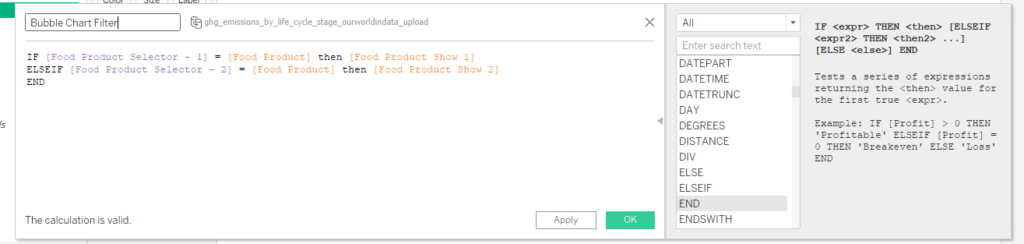
At that point, I just specified that it needs to be true in order for it to work the way I wanted. That means that the parameter selectors I created must each pick out something that exists and display here.
Dashboard Design for Waffles & Pancakes
This data visualization really involved a lot of different things to make it work. Each individual feature would not be able to function without the others. Here is how I put it all together in the end.
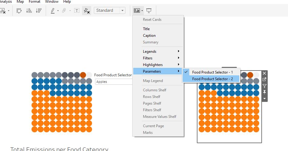
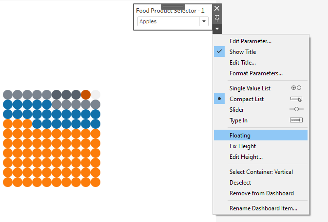
The snippet below shows that I started putting the two waffle charts onto the dashboard. I specified for each Food Product Selector parameter to show up in the form of a floating compact list. What this will do is create a drop down menu and let me place it wherever I want.
Actions for the Waffle Charts
Interactivity in a data visualization is cool. It’s even cooler if you can get one chart to then affect the view of another chart at the same time. That’s what I used actions for here.
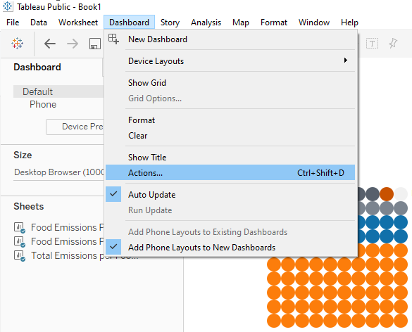
In this case, I created two parameter actions. I wanted each parameter selector to be able to change the display of the waffle chart. We know this will work because we already have a calculated field filtering each waffle chart for the results.
In one parameter action, I check the box for one waffle chart as a source. The other parameter action specifies the other waffle chart.
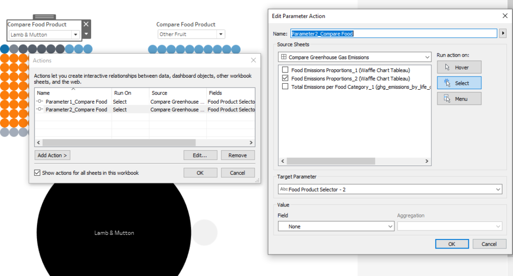
The bubble chart functionality is already taken care of because of the other calculated field filtering it on its respective worksheet. That means that the viewer will select from the drop downs to make the waffle charts change. And then however the waffle charts change will affect the bubble chart. It’s sort of like a chain reaction. Pretty neat.
Now onto finessing the data story we want to tell.
Data Storytelling in Tool tips
As I’ve mentioned in at least a few of my tutorials, Tableau tool tip notes basically start out as a box full of generated data fields. It doesn’t help the viewer very much because it’s not written in familiar language. So I often change my tool tips to be more readable.
Here is the tool tip I customized on the bubble chart worksheet. This will help us communicate why one bubble is larger than another when they are being compared.
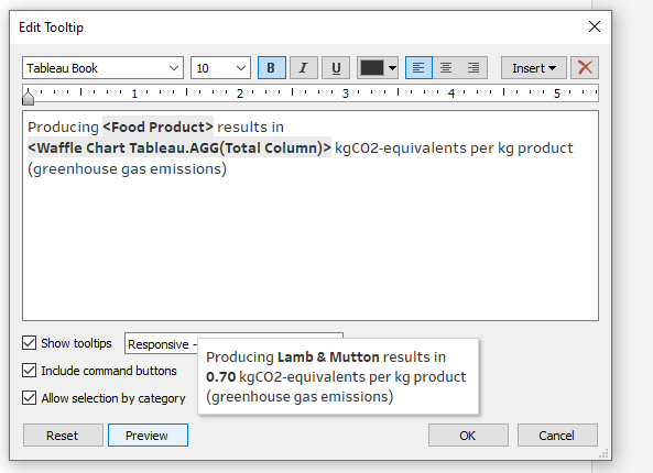
Here is the tool tip I customized on each waffle chart. What this will show is the broken down percentages of each supply chain activity. Producing a certain food product could have a certain breakdown of factors but will result in a total amount of emissions.
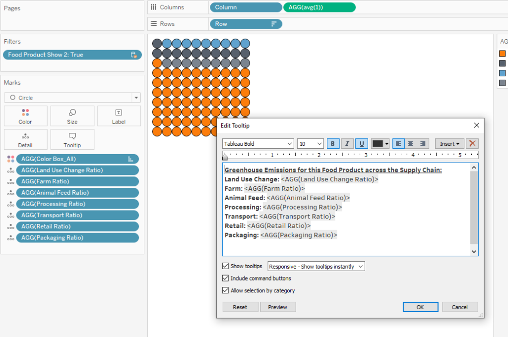
One issue I initially noticed when hovering over my waffle chart was that it was simply accumulating percentage as I moved the mouse over every circle in the waffle. We know that’s not correct, so I removed that and just included a list instead of all the “ratio” calculated fields I made earlier. This will give me percentages in the tool tip.
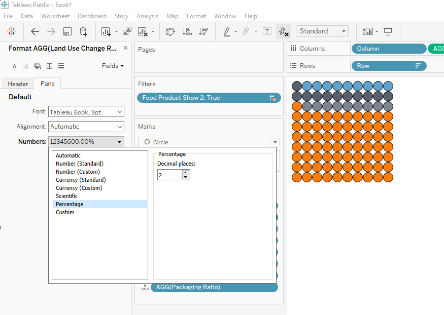
I took it a step further and formatted the fields to read as actual percentages instead of just decimal numbers.
The Final Data Visualization
After all of that work, here is what I ended up putting together. I added a floating background image on the dashboard from Pixabay to complete the vision I was going for. I did this via the drag and drop options in the bottom left of the dashboard view.
Now the viewer can compare a food product in list one and a food product in list two. Those two selections will display two different gas emission waffle charts. And then the bubble chart will display the total emissions for each two products selected. Try it for yourself here in the interactive data visualization! It works best viewed on a desktop or tablet.
In the screenshot below, it is comparing “Beef (beef herd)” and “Berries & Grapes.” Even though transportation seems to be more of a factor in the production of berries & grapes, beef still has way more greenhouse emissions. We can see from the legend that this is due to the farm aspects of the supply chain. Here’s more context on the why.