Ever heard the phrase “less is more”? It sounds great in theory, but it can actually be pretty hard to implement when presenting data.
What I have discovered from participating in MakeoverMonday for five straight weeks now is that I definitely have a creative side as well as a technical side.
Often times though, we find that we really need to keep things more “simple,” especially perhaps in a business setting.
Simple ≠ Boring
Simple doesn’t have to mean boring though! There is something to be said about a data visualization that is minimal in terms of data ink ratio but is visually pleasing by selective use of color, chart choice, and more.
For this week’s challenge, I set out to make a simple yet engaging data visualization. This is a challenge for me because I’m used to incorporating a ton of detail in creative ways with pretty much everything I do.
Okay, so let’s get into some of my process and how I approached the week’s data set. In the following context and demo, I wanted to highlight my thinking process and how the visualization evolved over time. You often see people post just the final result, but there is actually a lot of experimenting that can happen beforehand.
Context on the Data Set
This week’s data set focuses on the fact that actor Daniel Craig is retiring from his role as James Bond in the movie franchise. With that being said, YouGov surveyed the opinions of Britons on who they would like the “next James Bond” to be. An interesting note is that there seems to be a difference in opinion between those in favor of leaving EU and those who are in favor of remaining in EU in Brexit.
Initial Concept
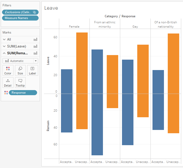
Here is basically what I first tried visualizing in Tableau Public. If I’m comparing categories, I make it a point to at least consider a bar chart in the beginning. Sometimes, we really don’t need to make things complicated and see what is the most straight forward way to convey information.
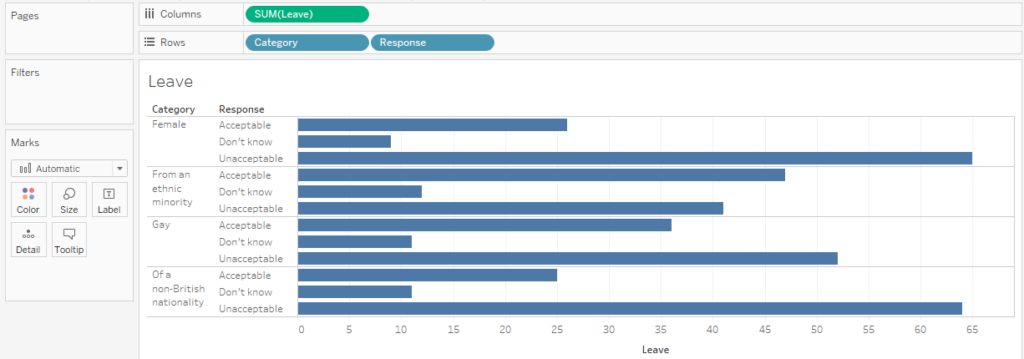
However, as you can see, the Category pill and the Response pill sitting on the Rows shelf seem to show a lot of information at once. Sure if you spent time reading everything, you could see the information. But it’s not easily readable for quick insights and finding correlations because everything is presented all at once.
Experimentation
From here, I right clicked and edited the axis on a chart to specify “Reversed” to create a butterfly chart. Sometimes this involves playing with the axis on each chart or even dragging and dropping the charts around to get it to do what you want. The flexibility is awesome in Tableau. 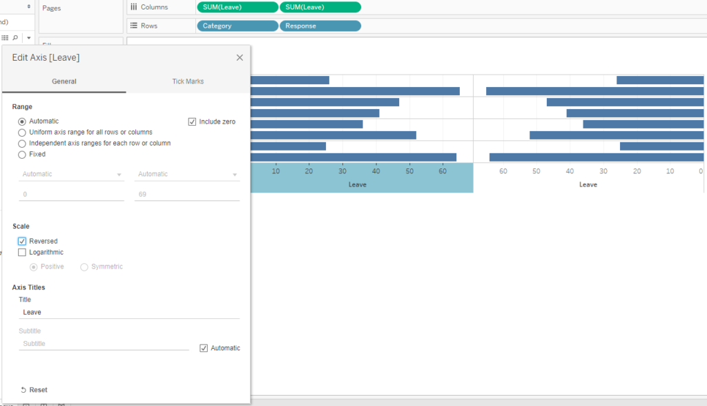
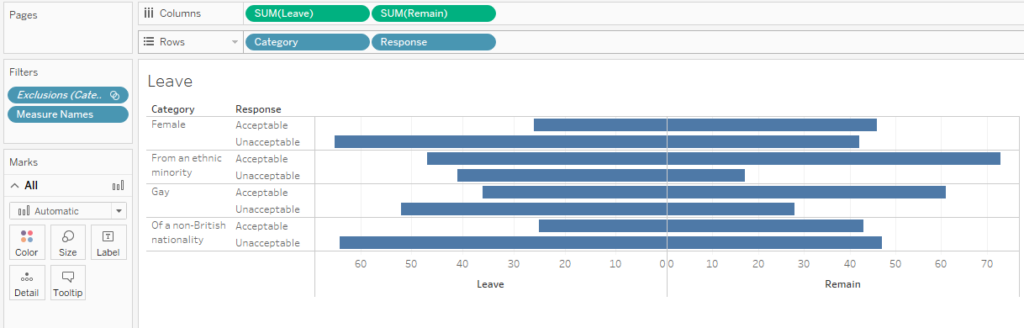
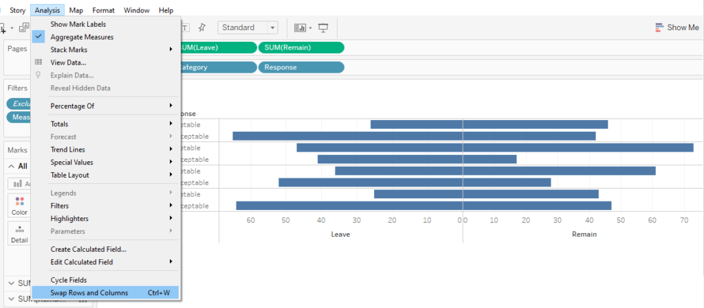
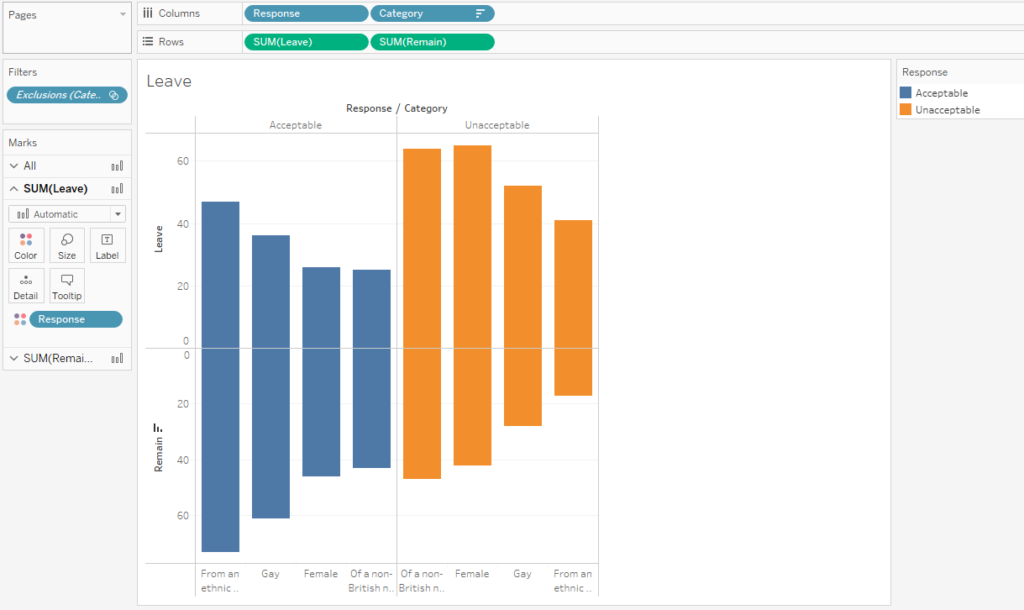
From here, I decided to look at swapping rows and columns to make all the bars vertical for a different look. I wanted my focus to be on comparing opinions between “leavers” and “remainers.” Maybe some people might have kept them horizontal for a “tug-o-war” kind of feel, but I just wanted to explore something different.
Swapping the rows and columns seemed to somewhat go towards my goal, but the bars still seemed to be all over the place. Color didn’t seem to help much so far.
Sorting by descending values didn’t really help either because the categories switch around in different orders on the same chart, which could be a little unintentionally deceiving to the viewer.
New Approach
I then realized that I think I should try multiple charts and then space them out on a dashboard. This would accomplish a few things for me:
Consistent order of categories (future characteristics of Bond, James Bond)
Clear colors to showcase responses
Clear distinction and separation between “leavers” & “remainers”
In order for me to make multiple little charts, I made all the “style adjustments” I wanted in one chart. I then duplicated the worksheet over and over. Lastly, I put the Category pill on the filters card to filter the respective categories. On the respective worksheets, I specified other categories instead. 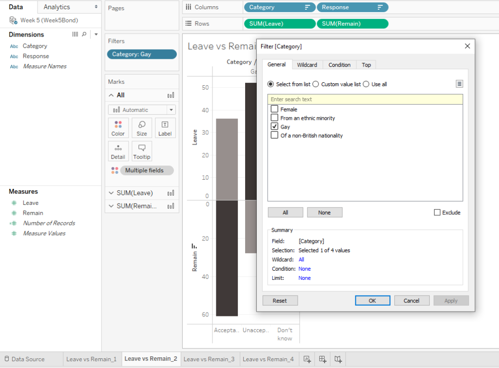
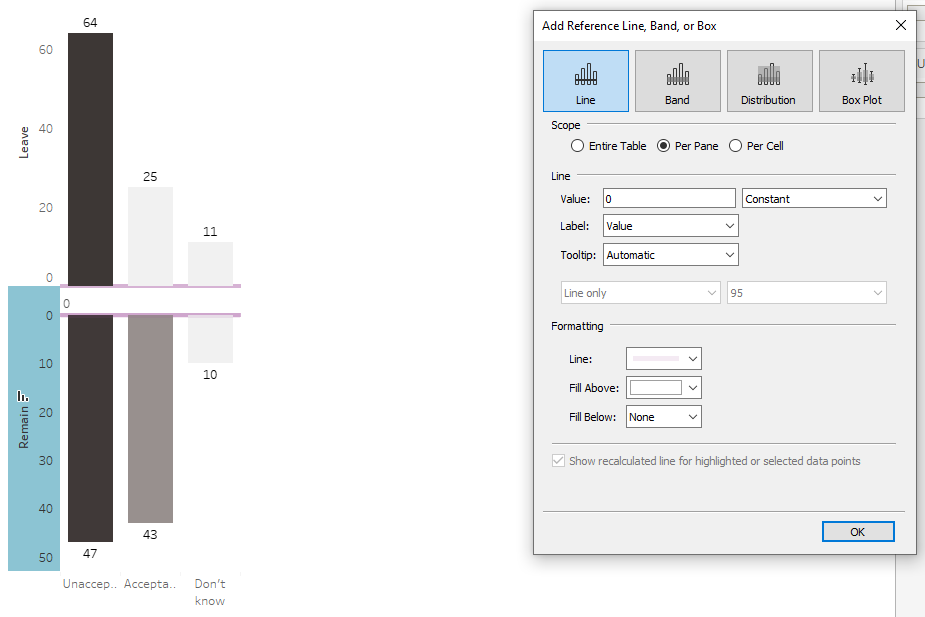
In the midst of doing this, I explored colors again as well as reference lines. The space between the bars really seemed to work for me, so I decided to keep that.
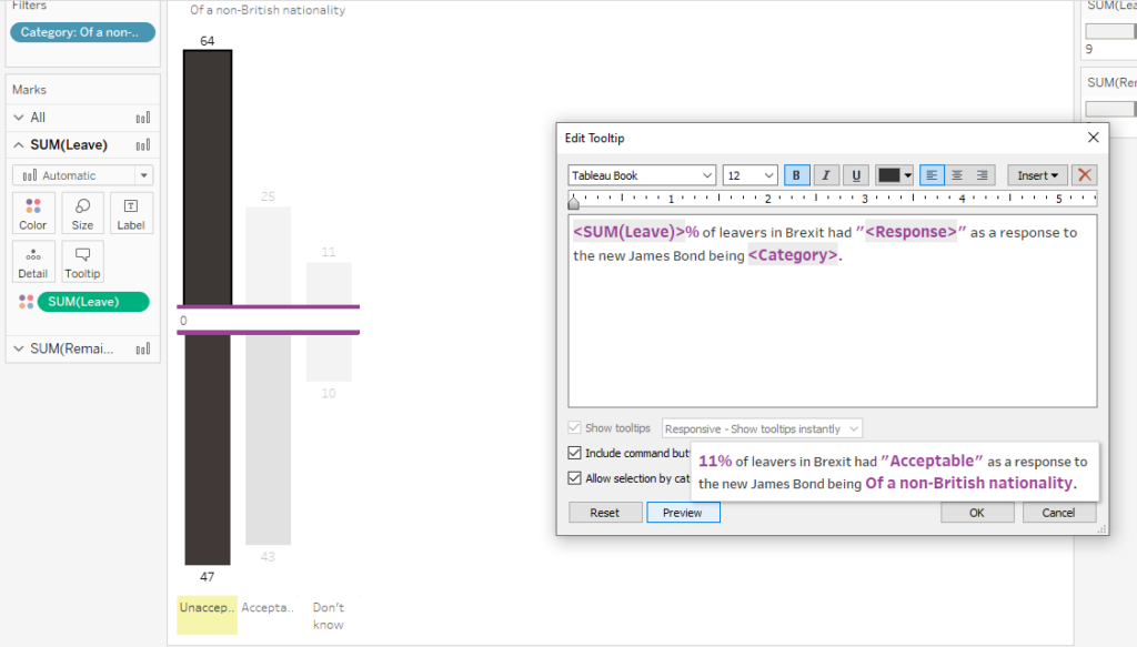
Tool Tips
I explored tool tips to customize the insight a bit. Later on, I reformatted the numbers to show as actual percentages. I had to re-edit the tool tip to make sure it read correctly.
Keep in mind with these charts that your changes apply per chart. After creating a tool tip for the top set of bars, I needed to create another one for the bottom. The same thing applies for reference lines, colors, marks, and more. If I didn’t have the “butterfly” chart situation going on, then I wouldn’t have had to have the extra consideration. I just wanted to point this out, so you don’t find the same initial frustration as me. 
In this case, I mostly copied and pasted but swapped out SUM(Leave) with SUM(Remain) in the other tool tip.
At this point, I duplicated all the worksheets and filtered for each category I wanted to examine. However, once I dragged and dropped the sheets side by side on the dashboard, they lined up horribly.
Dashboard Disaster?
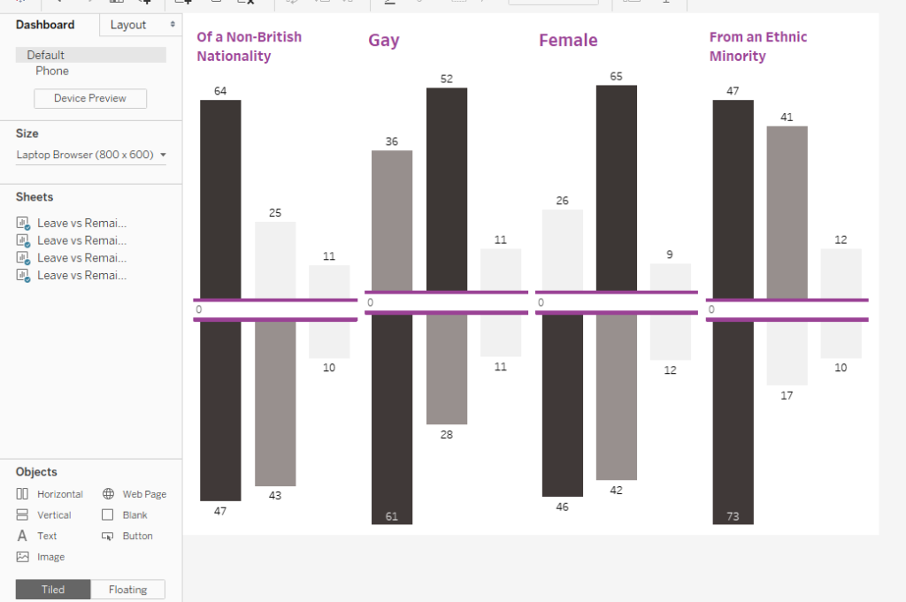
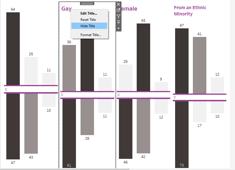
One of the neat parts about Tableau Dashboards is that you can layout things in all sorts of ways. What I did here was hide all the titles that came in automatically from the worksheets themselves. I then dragged and dropped “blank” spaces and then “text” from the bottom left corner of the dashboard. I mostly did this with the “tiled” option, not the “floating” option. This helped all of the charts to stay in line.
Here’s an example of one of the text boxes that I ended up orienting sideways. 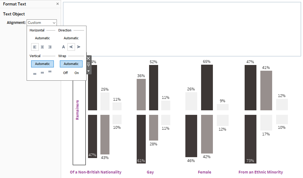
As you can see, at this point I switched the marks to show as percentages. Here’s a quick note on how I did that:
The “pills” (fields) are located along the left side of each worksheet where you can specify the default format.
I right clicked on the pills that dealt with Leaving & Remaining and then specified the following to make it show up as a percentage. Note that I didn’t pick Percentage itself.
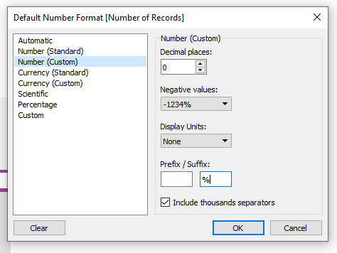
The data source format makes a difference. When I picked out Percentage, it took 73 to mean 7300% which is clearly not what I intended. For this kind of situation, a custom number format seems to accomplish what I want pretty quickly. I may revisit this to figure out other ways to address this.
The Final Result
Here is what I came up with for a “final result.”
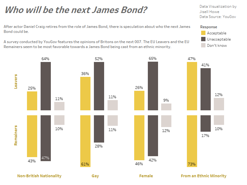
Opted for a gold/warm gray color scheme to fit closely with the movie franchise look and feel.
Used gold to highlight the “acceptable” responses as opposed to highlighting “unacceptable” or “don’t know” responses.
Kept the same order of responses across the dashboard (acceptable – unacceptable – don’t know) for each category
Used the white space and separation between the bars to emphasize the diverging opinions of “leavers” vs. “remainers.”
And here is the link to the interactive data visualization! It looks best when viewing from desktop or tablet.
If I were to revisit this again, I might eliminate the legend and use the colors to highlight specific words. Then again, gold might be hard to read unless it is on a dark background. As you can see, there are many decisions to make.
The main takeaway is that simplifying your presentation will allow the viewer to not be overwhelmed with data.
Thanks for reading. Now it’s time for a martini. Shaken, not stirred. ;)